
The Wellness Fest
The Brief
To create a brand for an international wellness festival focused on employee well-being.
Taking place over three weeks, the event blended virtual and in-person experiences, guided by five core pillars of wellness...
Physical . Mental . Social . Intellectual . Financial
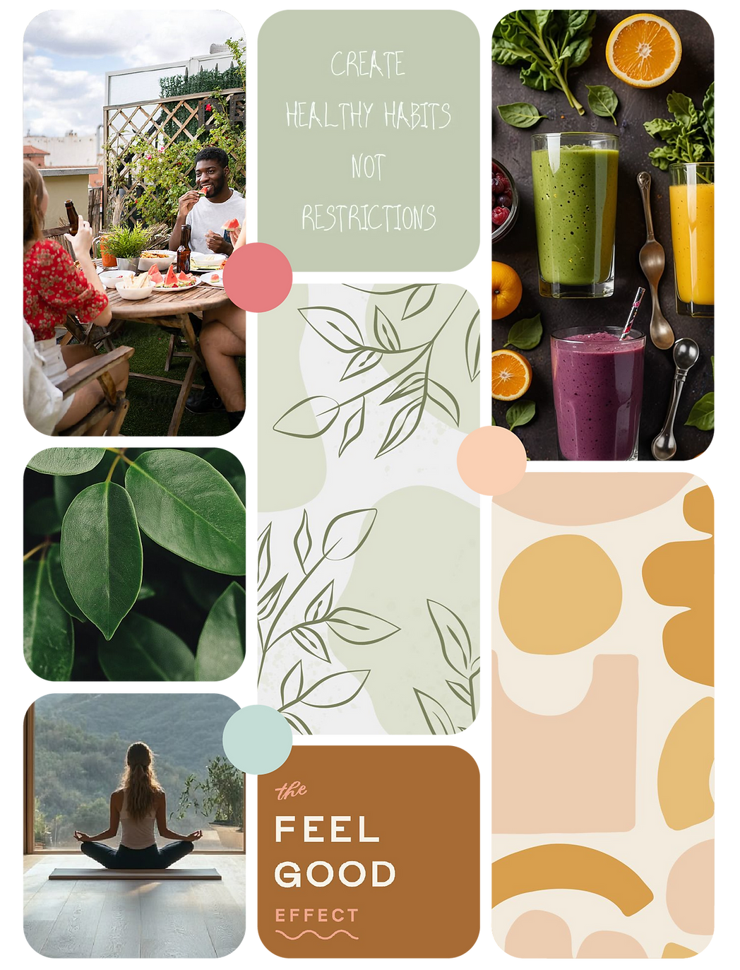
The Moodboard
To support the festival’s goal of relieving workplace stress and promoting wellbeing, I drew inspiration from wellness brands, using natural elements to convey calm and harmony.
By incorporating organic and botanical forms, textures, and patterns, I crafted a moodboard to capture the true spirit of the festival.
The Brand
Typography
I chose a typeface with a handwritten quality to maintain a lighthearted and natural feel within the logo, whilst incorporating the company icon within it.

Brand Pattern
Nature-inspired shapes and patterns formed the basis of a brand element used throughout the festival. Pastel tones ensured the design remained subtle, making it ideal for background use with layered text and visuals.
Sub-brands
Every event and activity was intentionally crafted to embody the five pillars of wellness, with branding designed to convey this connection.
By using color psychology, I created logos for each pillar and incorporated their colours strategically throughout the festival’s communications.


The Result
The branding effectively cut through the corporate communication clutter, making Wellness Fest content instantly recognisable and distinct from routine work messages, ensuring employees didn't miss out on any activities that were happening.
Communications
Digital
With a large portion of employees working remotely, a large part of the promotion of the Wellness Fest was digital.
Through presentation slides, intranet pages and email, branded templates were supplied throughout the 3 weeks to ensure brand consistency.

Slide Decks

Emails

Intranet