
Green Park Legal
The Brief
This rebrand project was for a legal firm specialising in claims for motorcycles, scooters, and mopeds.
They aimed to reposition themselves within the industry by expanding their services to offer a broader range of legal support beyond just motorcycle-related cases.
The core brief was to develop a brand identity that conveyed professionalism and prestige under the new name, Green Park Legal.

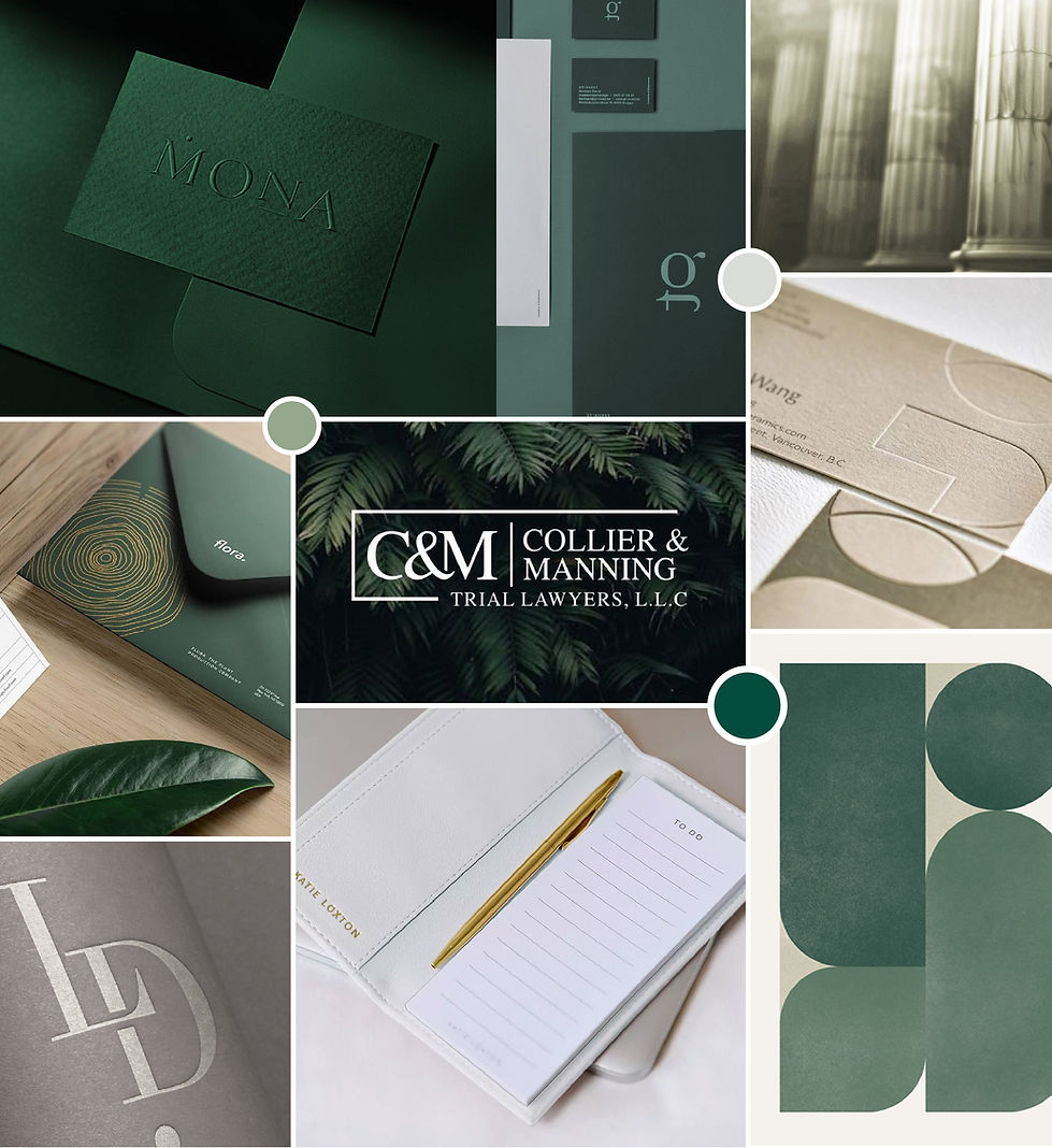
The Moodboard
During the initial research phase, I explored a luxurious aesthetic to align with the brief. Green was chosen for its professional, calming, and prestigious qualities, as well as to reflect the client’s preference for green tones. This also resonated with the name 'Green Park'.
The visual direction drew on high-end, embossed-style collateral to convey a sense of understated elegance and simplicity. I was drawn to the concept of a bold, distinctive icon integrated within a typographic logo, designed to adapt across different formats and applications.


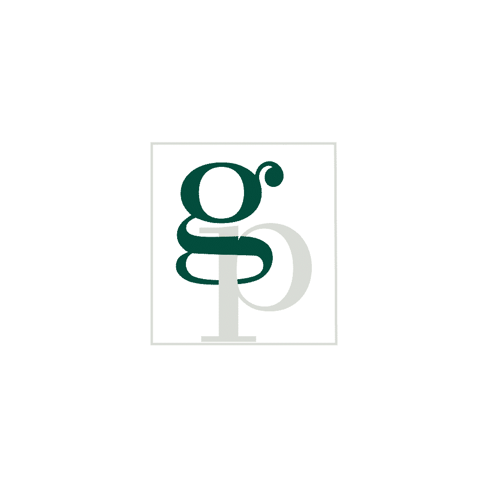
The Logo
Typography
I selected an elegant serif typeface for the logo, featuring a striking contrast between thick and thin strokes.
I specifically searched for a font with a graceful 'G' that could be interwoven with the 'P' to form a distinctive logomark, which could also be integrated into the full wordmark logo.
This concept laid the groundwork for the logo, inspiring an exploration of how the two letters could be artfully intertwined to craft a distinctive mark—versatile enough to take on multiple forms across different brand touchpoints.

To enable the use of the logomark within the full wordmark logo, I created a more compact version.
Realising there was a need for a horizontal version of the logo where the real estate height could be limited, I also came up with a wordmark logo using the distinctive font and colours to carry the brand throughout.
The Result
Resulting in a versatile logo with a strong sense of cohesion, empowering the client to apply it seamlessly across a wide range of applications during brand activation.

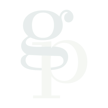

Colour Ways


Brand Application
To bring the brand to life for the client presentation, I developed a series of mock-ups that showcased its versatility across different contexts.


