


EverWell Events
The brief was to create a brand identity for an events company specialising in employee wellbeing. The client was keen to ensure the brand wasn’t limited to the wellness space, envisioning future growth into wider event experiences as the company evolved.
The Brief


The Brand
The goal was to build a brand that makes its mark in the wellness space while staying versatile enough to transcend it.
After initial discussions with the client to gather information on their vision, I created a moodboard taking inspiration from other brands out there that aligned with their values.
Keywords

I went with bold, sun-inspired colours and playful, organic shapes to keep things fun and energetic—and the client loved the result.
Midnight
Green
#0E393A
Turquoise
Green
#5CAFA1
Pink
#EB858C
Yellow
#FBC951
Combining a bold and friendly font with sunshine rays for the logo, it's clean and simple in it's design and the client felt it perfectly summed up what they stood for.
Empathetic . Hollistic . Uplifting . Colourful . Bold . Fun


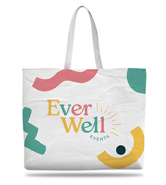
Merchandise
The client requested merchandise for launching the business, enabling them to stand out at networking events and shows.


Promotional
Material
To bring the launch to life, the client needed eye-catching business cards for networking and a set of social media templates to spark their digital presence.

 |  |  |
|---|---|---|
 |  |


Conclusion
The owners were thrilled with the brand's bright and colorful theme, confident it would make a strong impression at any event or function.
I really enjoyed this project, experimenting with striking colours and playing with a range of brand applications to bring the final vision to life. I’m proud of the outcome and believe it successfully captured the essence of the client’s brief.